MAZ
Digital Publishing Storefront and Reader
Complete redesign of the storefront and reader experience for iOS devices. Pixel perfect UI mockups, project UX, interaction design, design custodian of remote developer team for the project.
58% increase
total content downloads
62% increase
in single issue revenue
58% increase
total content downloads
62% increase
in single issue revenue
Social

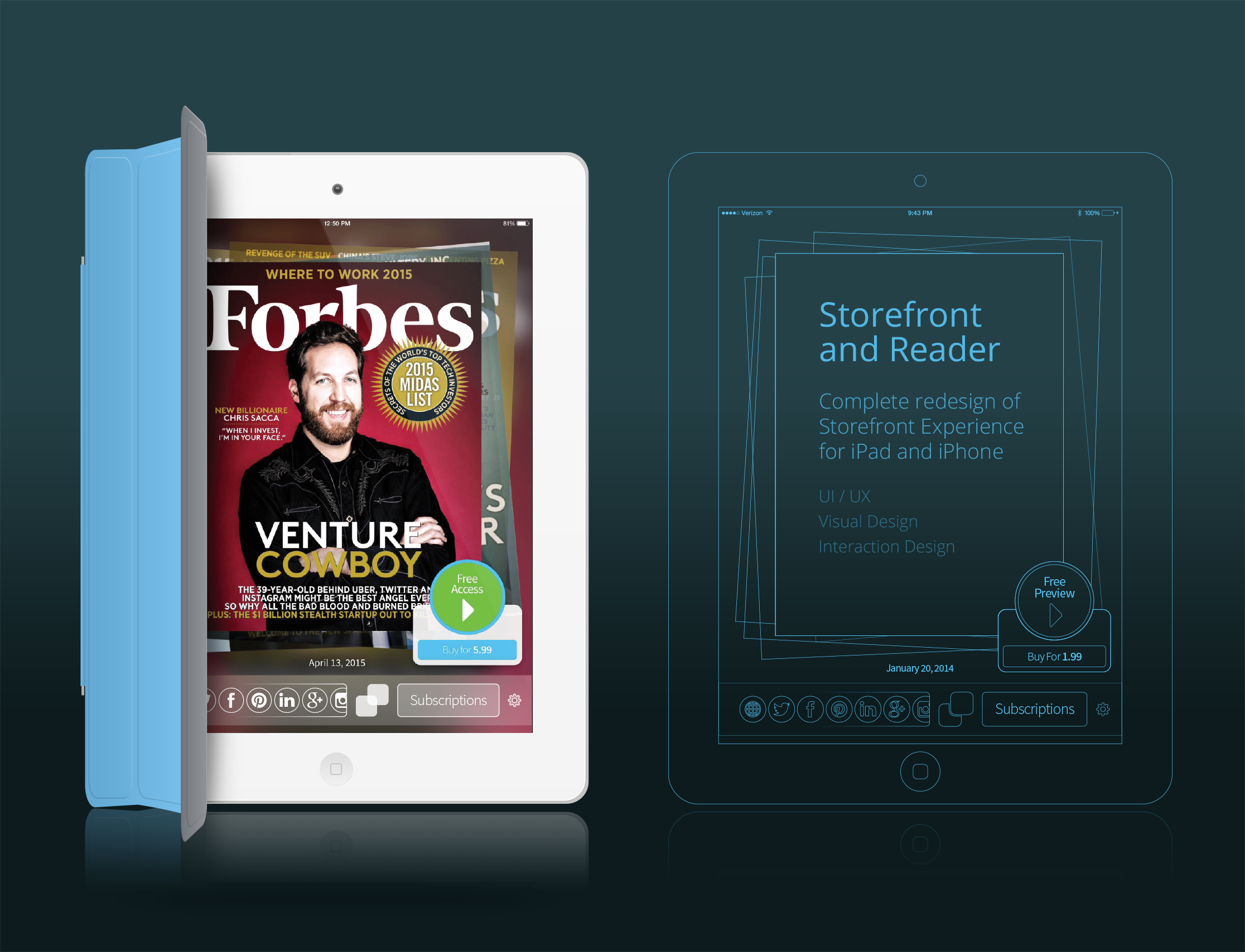
MAZ Storefront and Reader
A total redesign of the MAZ Publishing iOS App storefront and reader. Project includes, wireframes, pixel perfect UI designs, interaction design, UX.
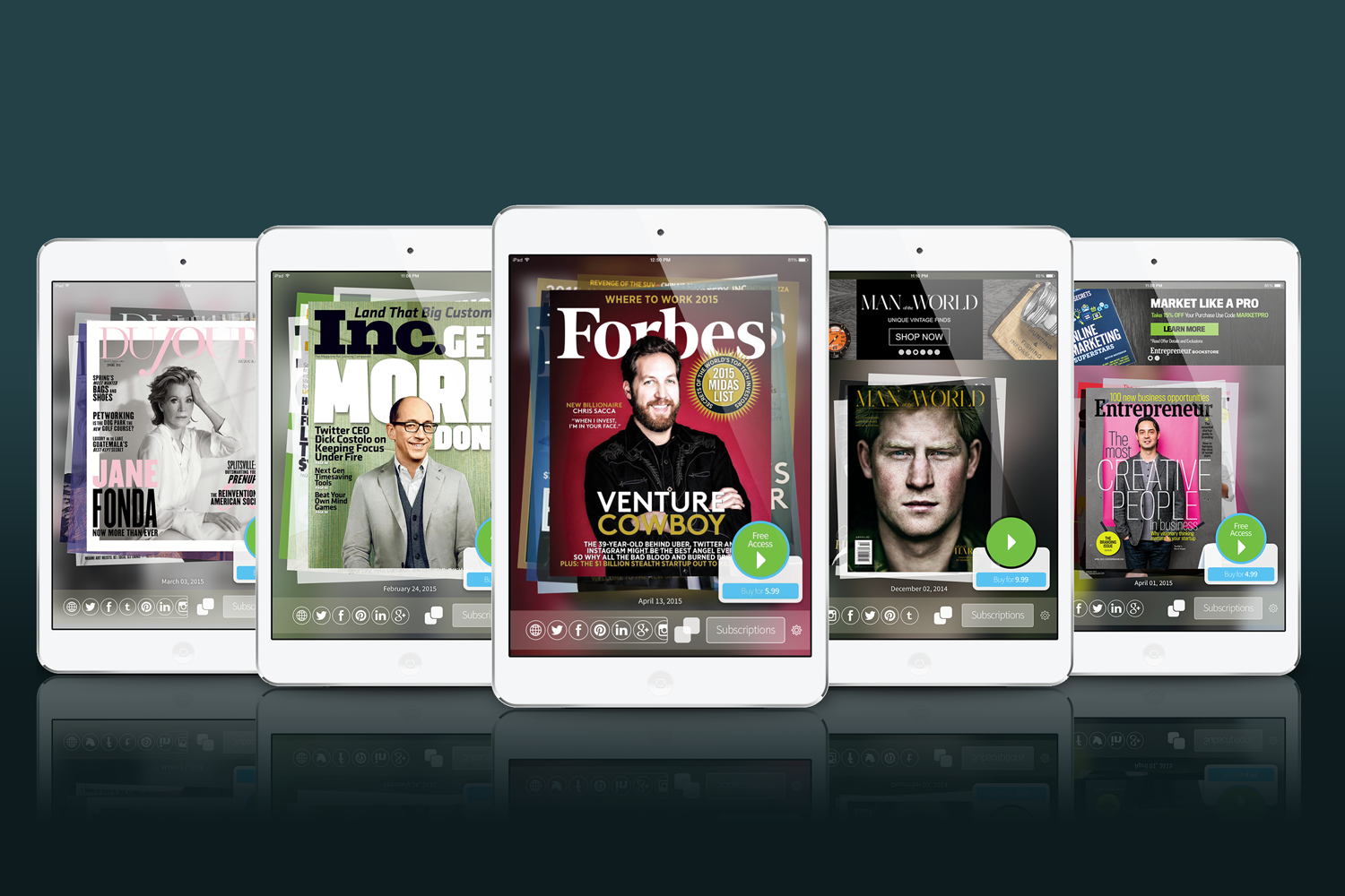
One Design to Beautifully Showcase Any Magazine Content
The base UI design for the app had to take into account the content that it would be selling / displaying. Over 1000 diverse publications now benefit from the same set of design rules.
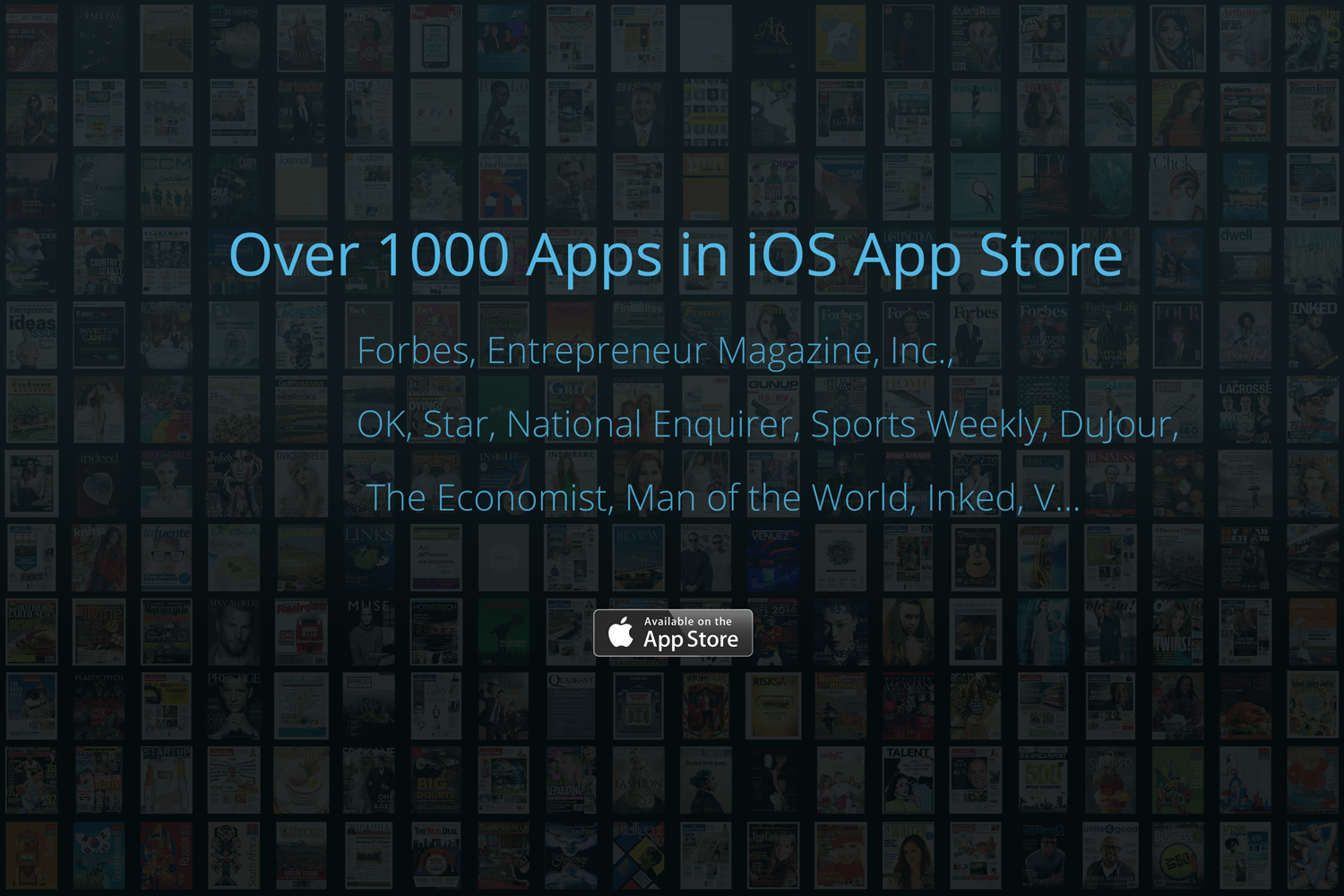
Over 1000 Apps
One UI had to cater for all these diverse publications.
The Many Views
Every view of the final app was prototyped in Illustrator, taking into account multiple states for each element, before being briefed to the international development team.
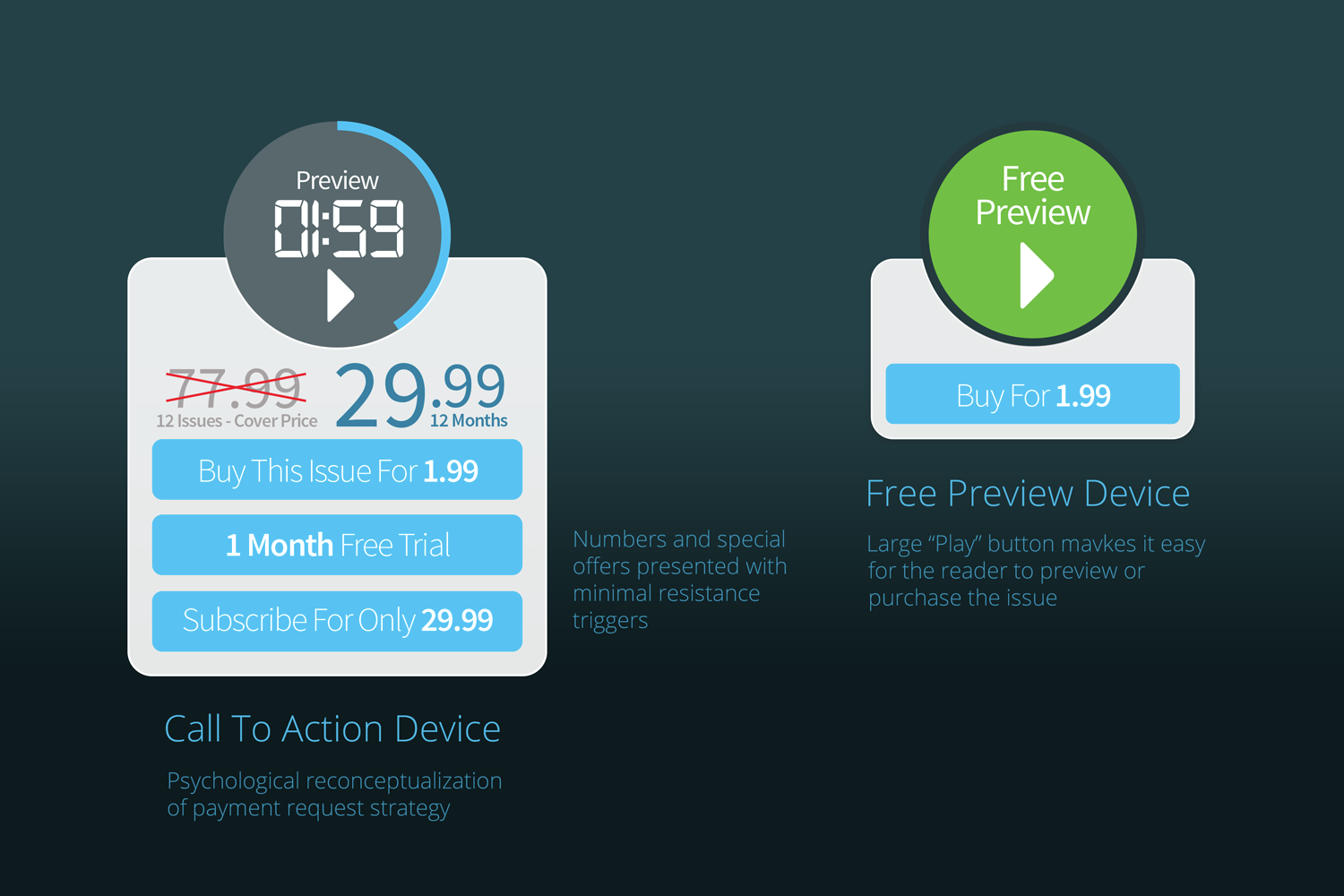
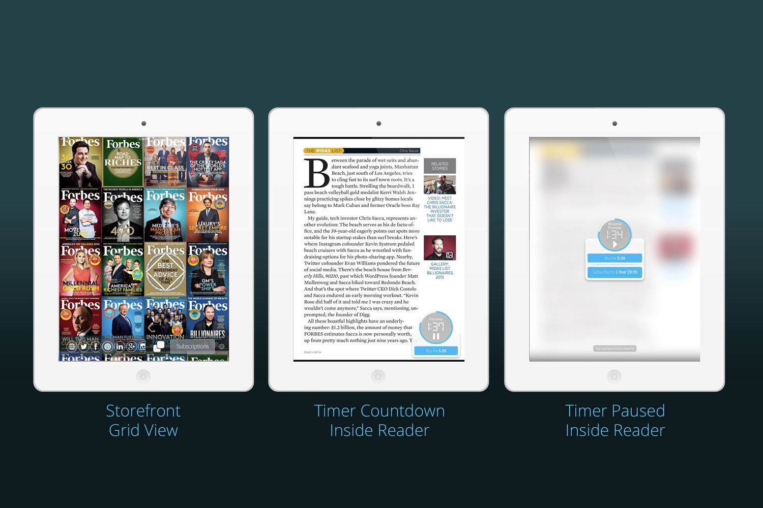
Making Dollar$
The core of the revamp was to push up subscription and single issue sales.
With the introduction of Timed Previews there was a:
58% increase total content downloads
62% increase in single issue revenue
60% increase paid content download
4 x paid conversion rate higher than the industry average
With the introduction of Timed Previews there was a:
58% increase total content downloads
62% increase in single issue revenue
60% increase paid content download
4 x paid conversion rate higher than the industry average

Digital Tearcard
This interstitial special offer pops up in all non-purchased issues to cross-sell subscriptions.
And it worked! More people subscribe with these changes.
And it worked! More people subscribe with these changes.
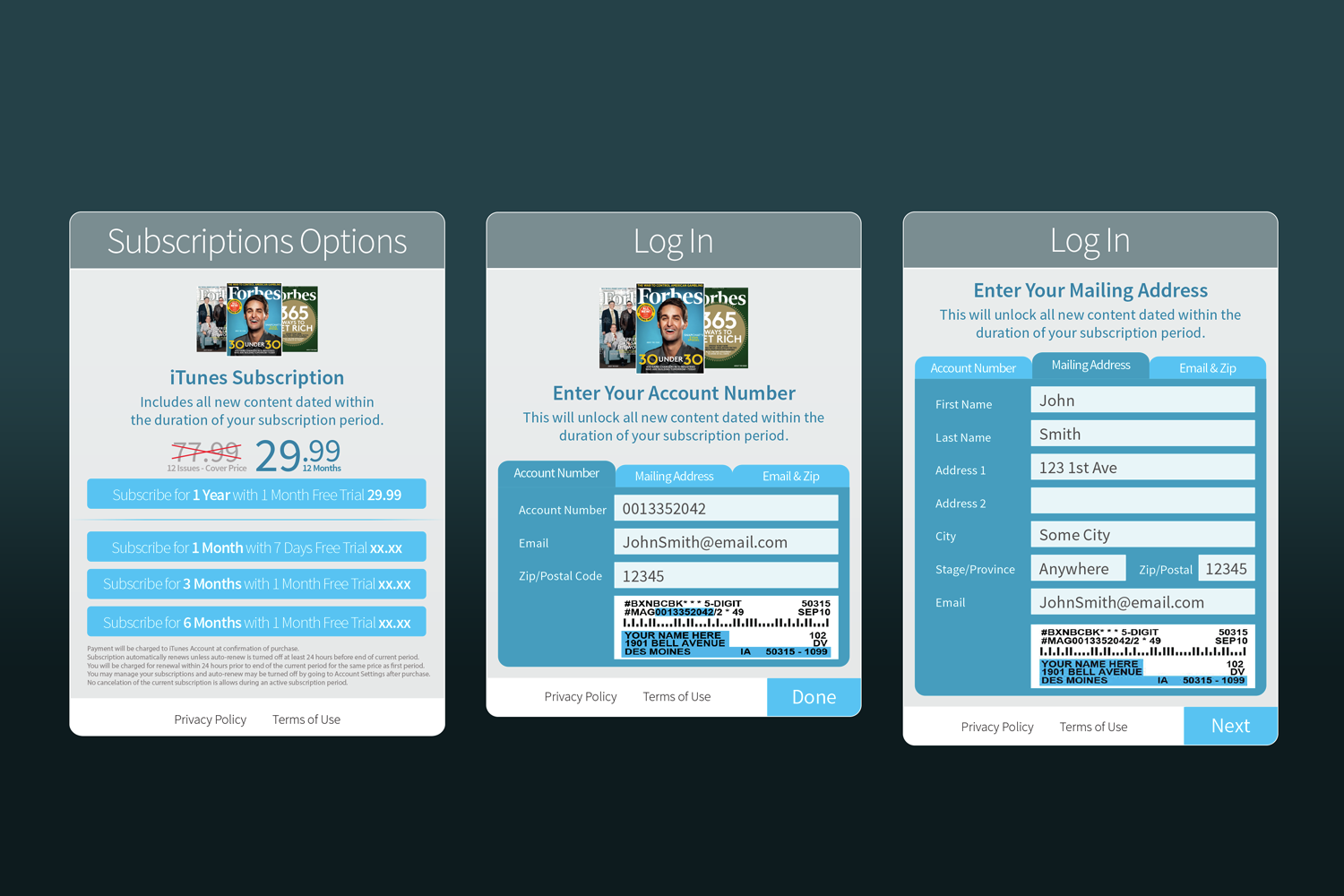
The Many Forms
The UI had to take into account that publishers had many different ways of authenticating against their reader's database.
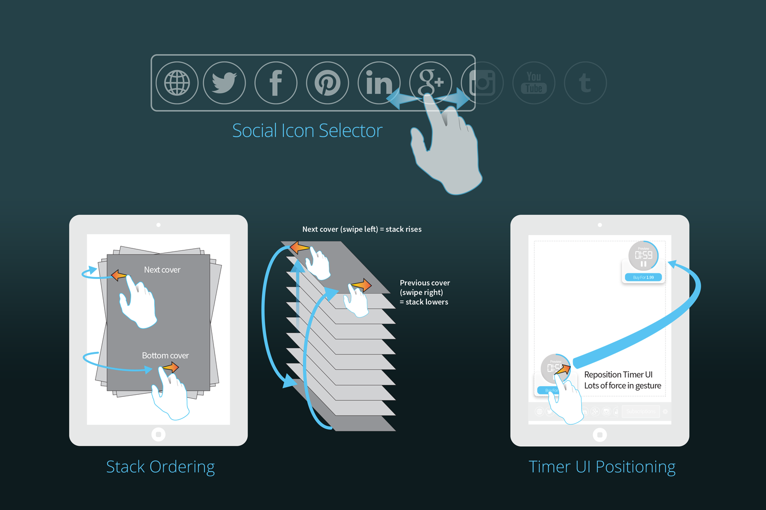
Interaction Design
Interactive rules and behaviours for all the needed states of elements.
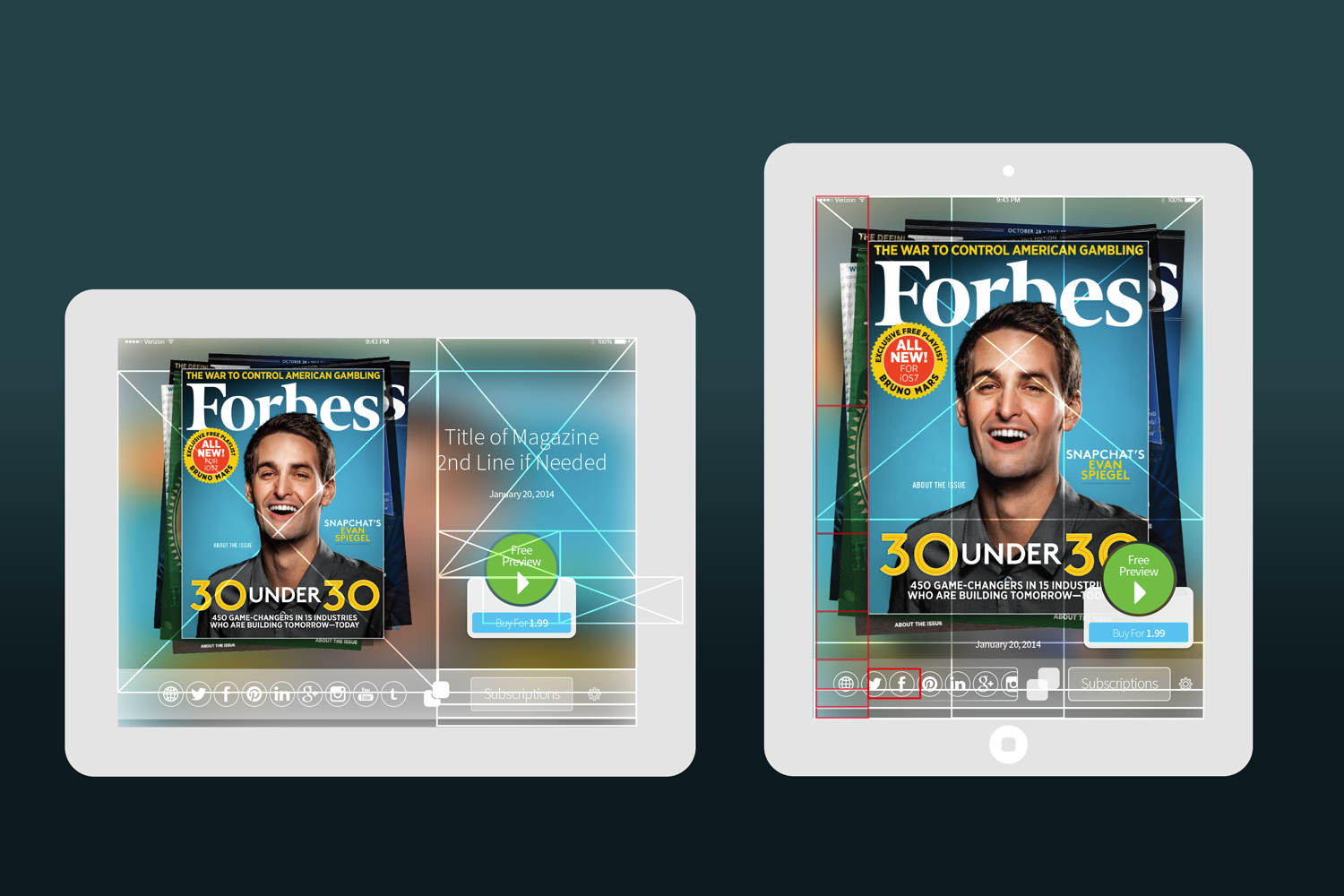
The Grids
Many permutations of the Golden Section ratio were used in the creation of the app. The size of the iPad informed the entire process. All elements share some reference to the size of the iPad screen. Where possible, these ratios inform the design, size and placement of elements on the page.